Many bloggers and webmasters get a decent income from Google Ads, also known as Adsense. Now, as responsive webdesign is turning more and more popular, it is important however to update your site and use mobile friendly Google Ads.
Recently I faced the problem that a mobile friendly site which worked perfectly, was “destroyed” as I added a Google ad unit with a width at 460px to it. When watching the site with mobile I had to scroll towards right to see the entire add, and thus the advantage of a responsive and mobile friendly website was gone. So, what did I do to fix it? It was very easy!
Mobile friendly Google Ads the complicated way
First I read in lots of places that you could add a certain code to your website and just add all the needed information, and thus based on the width of the browser of the user visiting your site, one of the different ads in the fitting size would be shown. Here you can find the code and if you want to do it the hard way, copy this code unto your page and just change the publisher ID and the ad codes. However, there is a much easier way of solving the problem.
[stextbox id="grey"]
<script type="text/javascript">// <![CDATA[

var width = window.innerWidth || document.documentElement.clientWidth; google_ad_client = "ca-publisher-id";

if (width >= 800) {

google_ad_slot = "ad-unit-1";

google_ad_width = 728;

google_ad_height = 60;

} else if ((width < 800) && (width > 400)) {

google_ad_slot = "ad-unit-2";

google_ad_width = 300;

google_ad_height = 250;

} else {

google_ad_slot = "ad-unit-3";

google_ad_width = 320;

google_ad_height = 50;

}

// ]]></script>

<script type="text/javascript" src="http://pagead2.googlesyndication.com/pagead/show_ads.js">// <></script>[/stextbox]
Mobile friendly Google Ads the easy way
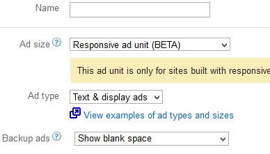 Luckily Google knows the importance of mobile friendliness and therefore they are now giving us a much better tool. As you log into your AdSense account all you need to do is to create a new ad unit and when you have to choose size, pick the Responsive Ad Unit (Beta) option. Do the rest of the setup as normal, copy the code unto your page, and you will now have a mobile friendly Google Ad on your site, that will automatically show itself in the correct size, based on the size of the display of the users dropping by.
On the illustration to the right you can see how to do so, and it is as easy as it sounds. So, go ahead, try it, and if it worked for you, or maybe if it did not, write a comment and share your insight and thoughts.
If you are looking for a mobile friendly WordPress theme, read our following article presenting five responsive themes.